MicroStrategy ONE
Create and Use Custom Properties
You can save and retrieve custom properties in an HTML5 visualization built with the MicroStrategy platform. The properties are key-value pairs, which are saved as part of the custom visualization and can be used by its code in order to drive its behavior and adjust the way the visualization renders.
Properties can be visible to the user or they can be hidden (internal to the visualization’s code).
- Visible properties are displayed in controls on the Properties panel that the developer can configure to reflect the representation of the properties. Users can interact with these controls when they use the visualization. The visualization code is responsible for reading the changes in the properties’ values and reflecting the changes accordingly—for example, changing the way the visualization is rendered.
- Hidden properties are not seen by the user. They are saved and used by the visualization's code to drive its behavior. An example of a hidden property might be the zoom level of a map visualization. When a user zooms on the map, the code can save the zoom level as a custom property. When the visualization is closed and reopened, the code can read the value of the zoom level property and automatically open the map to the same zoom level that it was when the visualization was closed.
APIs are provided in mstrmojo.vi.models.editors.CustomVisEditorModel to help you save and retrieve custom properties and customize the Properties panel for the visualization. These APIs include a number of different methods for setting and getting properties. They also support a number of frequently used controls that can be used to customize the Properties panel, such as pull downs, text boxes, and character groups that contain multiple other controls.
To help jump-start your work we have provided a template for a custom properties JavaScript class that you can open or download and unzip.
To create and use custom properties in an HTML5 visualization:
-
Select or create a visualization that you want to add custom properties to
-
Create the JavaScript class that will render the custom Properties panel for the visualization
-
In your JavaScript code, get and set the values for the properties saved with the visualization
- In your JavaScript code, use the controls supported by the MicroStrategy JavaScript framework to create your custom Properties panel
- In your JavaScript code, use "disabled" or "config" optional configuration values for properties to conditionally render controls
A detailed explanation of each step is provided below:
-
Select or create a visualization that you want to add custom properties to.
Save the plug-in for the visualization as plugins/YourVisualizationPluginFolder in the MicroStrategy Desktop or Web installation directory. Like all plug-ins, it has a specific folder hierarchy. The steps below refer to changes made to files within the plug-in folder for the visualization.
-
Create the JavaScript class that will render the custom Properties panel for the visualization.
-
You can use the sample template shown below to create your JavaScript class. It assumes that the visualization is named D3BubbleChart. In your code, simply substitute the name of your visualization wherever you see D3BubbleChart.
Copy(function (){
// Define this code as a plugin in the mstrmojo object
if (!mstrmojo.plugins.D3BubbleChart) {
mstrmojo.plugins.D3BubbleChart = {};
}
// Import the necessary library
mstrmojo.requiresCls(
"mstrmojo.vi.models.editors.CustomVisEditorModel"
);
//variable that represent the enum of all the widget type
var $WT = mstrmojo.vi.models.editors.CustomVisEditorModel.WIDGET_TYPE;
/**
* <p>Simple editor model for visualization using D3 library</p>
* <p>Define the properties displayed in property panel.</p>
* @class mstrmojo.plugins.D3BubbleChart.D3BubbleChartEditorModel
* @extends mstrmojo.vi.models.editors.CustomVisEditorModel
*/
mstrmojo.plugins.D3BubbleChart.D3BubbleChartEditorModel = mstrmojo.declare(
mstrmojo.vi.models.editors.CustomVisEditorModel,
null,
{
// Define the JavaScript class that renders your visualization properties
scriptClass: 'mstrmojo.plugins.D3BubbleChart.D3BubbleChartEditorModel',
getCustomProperty: function getCustomProperty() {
// Fill the property data here
}
}
);
}()); - In this class, you must import mstrmojo.vi.models.editors.CustomVisEditorModel, as shown in the code above.
-
In this class, you use the getCustomProperty function to define the controls on the custom Properties panel, as shown in the code above. This function returns an array. You can define the controls inside it.
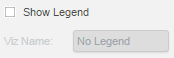
The sample code shown below will render a check box and a two-column row that contains a label and a text box. You can use this sample code as a guide to help you create your own custom controls.
CopygetCustomProperty: function getCustomProperty() {
return [
{
name: "Custom Category Name"
value: [
{
style: $WT.EDITORGROUP,
items: [{
style: $WT.CHECKBOXANDLABEL,
propertyName: "showLegend",
labelText: "Show Legend",
},{
style: $WT.TWOCOLUMN,
items: [{
style: $WT.LABEL,
width: "40%",
labelText: "Viz Name:"
},{
style: $WT.TEXTBOX,
width: "60%",
propertyName: "vizName"
}
]
}
]
}
]
}When this code is used, the Properties panel looks like this:
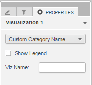
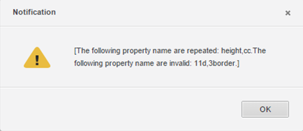
In the JavaScript code that renders the Properties panel, each control on the panel is defined by a style key. The propertyName key acts as an identifier and is the key that is saved for that property. It must be unique for each property. If there are duplicate or invalid propertyName keys, users receive a warning message with a suggestion about which propertyName key is a duplicate or invalid.
In the getCustomProperty() method in your JavaScript code, you can use the following , which are supported by the properties API:
-
It is a good practice to use a separate JavaScript function for the manipulation of the visualization related to custom properties. This function will be called when a user interacts with the controls, rather than the default function, plot(). To use a separate function, do the following:
- In the JavaScript class that renders the visualization, create a function that performs the changes you want to make on the visualization when a user performs an action on the control. This function should be at the same level as the plot() function.
-
In the JavaScript class that renders the custom Properties panel:
-
In the getCustomProperty() function, declare a variable that represents the container for the entire visualization using this.getHost() on the getCustomProperty() function. For example:
CopygetCustomProperty: function getCustomProperty() {
var myViz = this.getHost(); -
In the config for the control causing the changes, add a callback function to the method you created in step 1. After the callback function has been executed, perform the actions needed to render the changes, such as refreshing the visualization or updating the labels. For example:
Copyconfig: {
callback: function () {
myViz.refresh();
// You can also call other functions in your viz, such as myViz.updateLabel()
}
}
-
Depending on the function that is called, the domNode may or may not be regenerated.
- If you don’t make a callback, the plot() function is called by default. This function runs the code of your custom visualization, but does not generate a new domNode. You can add code in the plot() functiond to manage the amount of changes.
- If you do make a callback, the callback function is applied and plot() is not called. This causes the entire visualization to be refreshed and the domNode to be regenerated.
- Save the JavaScript class under plugins/YourVisualizationPluginFolder/javascript/mojo/js/source.
-
-
Configure visualizations.xml so that the node for the visualization you are customizing points to the JavaScript class that renders the custom Properties panel.
-
Navigate to plugins/YourVisualizationPluginFolder/WEB-INF/xml/config/visualization.xml in your MicroStrategy Desktop or Web installation directory.
-
Open visualization.xml and find the <visualization> node for the visualization you are adding the custom Properties panel to. Add an editor-model attribute that points to the JavaScript class that renders the custom Properties panel. In the sample code below, the editor-model attribute is shown in bold:
Copy<visualizations>
<visualization-list name="ajax">
<!--add editor-model="plugins.D3BubbleChart.D3BubbleChartEditorModel" -->
<visualization id="D3BubbleChart" desc="D3 Bubble Chart" scope="19" projects="" style-name="D3BubbleChart" is-mojo="true" attribute-minimum="2" metric-minimum="1" editor-model="plugins.D3BubbleChart.D3BubbleChartEditorModel" drop-zones="plugins.D3BubbleChart.D3BubbleChartDropZones" widget-type="7"/>
</visualization-list>
</visualizations> - Save visualization.xml.
-
-
In your JavaScript code, get and set the properties saved with the visualization.
In the plot() method of the JavaScript class that renders the visualization, you can set and get the values of the properties for the controls on the Properties panel. You can use these values when you render the visualization. For example, if a user checks the Show Legend check box, you can get the value of showLegend as “true”.
CustomVisBase.js provides the following methods, which can be called directly in your code:
-
setProperty(propertyName, newValue, config)
Sets a property’s value that will be saved with the visualization.Parameters:
- propertyName: Name of the property
- newValue: New value to be saved. Must be a String (primitive types will be converted to String) or a two-level object whose second level properties are String.
- config: Optional configuration includes:
- onPropertyChange: Function that returns relative properties that should be changed.
- suppressData: Flag that indicates whether to not receive updated data from the back-end. If it is false, loading dialog will show and partial updating will run after data is returned. If it is true, the process will be silenced and there will be no loading on the GUI. You may need to update your visualization by yourself.
- requestDefinition: Flag that indicates whether to request definition in addition to data.
- clientUndoRedoCallback: Function that will be called after undo/redo. If this function is undefined, partial updating will run by default. Otherwise this function will run, and you may need to update your visualization by yourself.
This method saves the values to the back-end, causing a round-trip to the server. Use it carefully in plot(). Avoid sending multiple requests or looped calls since by default it will run a partial update to render the visualization again.
- getProperties()
Returns all the properties saved with the visualization. The default value will not be returned if set by setDefaultPropertyValues().Can be called in plot() to change the rendering of your visualization. - getProperty(propertyName)
Returns the value of a specific property. The default value will be returned if set by setDefaultPropertyValues(). Can be called in plot() to change the rendering of your visualization. -
setDefaultPropertyValues(defaultValues)
Sets the default value for the properties. Should be called in plot() and before getProperty(). The value will be used by getProperty() and the controls in the Properties panel.Parameters:
-
defaultValues: Object that contains the property name and its default value. For example:
Copyplot: function () {
this.setDefaultPropertyValues({
showLegend: 'true',
vizName: 'abc',
valuefont: {
fontSize: '16pt',
fontFamily: 'Arial',
fontColor: mstrApp.getThemeClassName().indexOf('dark') >= 0 ? '#fff' : '#000'
}
});
// other code...
}
-
- getDefaultProperties()
Returns the default values set by setDefaultPropertyValues().
-
-
In your JavaScript code, use the controls supported by the MicroStrategy JavaScript framework to create your custom Properties panel
In the getCustomProperty() method in your JavaScript code, use any of the following controls that are supported by mstrmojo.vi.models.editors.CustomVisEditorModel.WIDGET_TYPE.
-
EditorGroup
Container that can be used to organize controls. Default padding and division line will be added. All other components can be put into the container.Definition:
- style: $WT.EDITORGROUP
- items: Components you want to put into the container
Sample code:
Copy{
style: $WT.EDITORGROUP,
items: [
// Child widgets…
]
} -
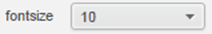
TwoColumn
Container that contains two columns in one row. Each column can nest another control, including another TwoColumn component. The user can specify each column's width. If the width is not set for each component, the default width for column one is "30%" and column two is "70%".Definition:
- style: $WT.TWOCOLUMN
- items: Components contained in the TwoColumn container
Sample code:
Copy{
style: $WT.TWOCOLUMN,
items: [
{
style: $WT.LABEL,
name: "text",
width: "30%",
labelText: "fontsize"
},
{
style: $WT.PULLDOWN,
propertyName: "textvalue",
width: "70%",
items: [
{
name: "10",
value: "aaa"
},
{
name: "20",
value: "bbb"
}
]
}
]
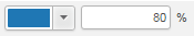
}When this code is used, the control will look like this:
-
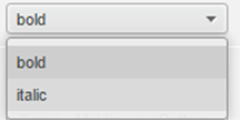
PullDown
pull down list. You can define the display text and value for each item.Definition:
- style: $WT.PULLDOWN
- propertyName: Identifier that uniquely represents the property
- items: Pull down menu items. Each item should contain name and value
- name: What is displayed in the pull down list
- value: Value that will be saved to the property if this item is selected. It should be unique among all the values of this pull down component.
Sample code:
Copy{
style: $WT.PULLDOWN,
propertyName: "pd",
items: [
{
name: "bold",
value: "0"
},
{
name: "italic",
value: "1"
}
]
}When this code is used, the control will look like this:
-
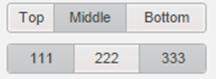
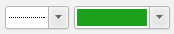
ButtonBar
Combination of several buttons arranged like a bar. Each button can have its own display text. You can choose multi-select or single-select mode for the buttons. Each button should have its own property name, and the values will be saved separately.Definition:
- style: $WT.BUTTONBAR
- propertyName: Identifier that uniquely represents a property
- items: Collection of buttons in the bar. Each item should contain labelText and propertyName
- labelText: Represents the display name on each button
- propertyName: Identifier that represents this item. It should be unique among all items of this button bar.
- multiSelect: Flag that indicates whether to use multi-select mode for selection. The default value is false, which means to use single-select mode.
Sample code:
Copy{
style: $WT.BUTTONBAR,
propertyName: "position",
items: [
{
labelText: "Top",
propertyName: "t"
},
{
labelText: "Middle",
propertyName: "m"
},
{
labelText: "Bottom",
propertyName: "b"
}
],
multiSelect: false
}The top button bar is single-select and the bottom one is multi-select. When this code is used, the control will look like this:
-
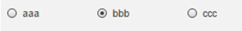
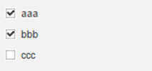
CheckList
Group of check boxes. Each check box can have its own display text. You can choose multi-select or single-select mode for the check boxes. Each check box should have its own property name, and the values will be saved separately. You can also specify the orientation.Definition:
- style: $WT.CHECKLIST
- propertyName: Identifier that uniquely represents a property
- items: Collection of check boxes in the list. Each item should contain labelText and propertyName
- labelText: Represents the display name on each check box
- propertyName: Identifier that represents this item. It should be unique among all items of this check list
- multiSelect: Flag that indicates whether to use multi-select mode for selection. The default value is false, which means to use single-select mode.
- orientation: Represents the orientation of the checklist. It can be vertical or horizontal. The value should be either "v" or "h", representing vertical or horizontal, respectively. The default value is "h".
Sample code:
Copy{
style: $WT.CHECKLIST,
propertyName: "cl",
items: [
{
labelText: "aaa",
propertyName: "a"
},
{
labelText: "bbb",
propertyName: "b"
},
{
labelText: "ccc",
propertyName: "c"
}
],
orientation: "v",
multiSelect: false
}This is a single-select checklist with horizontal orientation.
This is a multi-select checklist with vertical orientation.
-
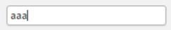
TextBox
Text box that allows a user to input text in it.Definition
- style: $WT.TEXTBOX
- propertyName: Identifier that uniquely represents a property
Sample code:
Copy{
style: $WT.TEXTBOX,
propertyName: "valueTxt"
}When this code is used, the control will look like this:
-
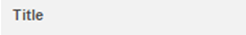
Label
Text label that displays a string.Definition:
- style: $WT.LABEL.
- labelText: Text to display
Sample code:
Copy{
style: $WT.LABEL,
labelText: "Title"
}When this code is used, the control will look like this:
-
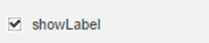
CheckBoxAndLabel
Combination of a checkbox and a labelDefinition:
- style: $WT.CHECKBOXANDLABEL
- propertyName: Identifier that uniquely represents a property
- labelText: Text to display after the check box
Sample code:
Copy{
style: $WT.CHECKBOXANDLABEL,
propertyName: "cc",
labelText: "showLabel"
}When this code is used, the control will look like this:
-
ComboBox
Combination of a text box and a button that can show a list of preset values.Definition:
- style: $WT.PREVIEWBUTTON
- propertyName: Identifier that uniquely represents a property
- items: Items of the pull down. Each item should contain name
- name: What is displayed in the pull-down list
Sample code:
Copy{
style: $WT.COMBOBOX,
propertyName: "d11",
items: [
{
name: 1
},
{
name: 2
}
]
}When this code is used, the control will look like this:

-
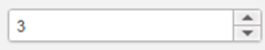
Stepper
Combination of a text box and two buttons that can increment or decrement the integer displayed. The value of this control must be integer.Definition:
- style: $WT.PREVIEWBUTTONWithStepper
- propertyName: Identifier that uniquely represents a property
- min: Minimum value of the component
- max: Maximum value of the component
Sample code:
Copy{
style: $WT.STEPPER,
propertyName: "ff",
min: 0,
max: 10
}When this code is used, the control will look like this:
-
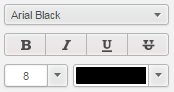
CharacterGroup
Combination of controls that help set font family, style, size and color. Unlike button bar or check list, the property names of the child controls have been preset: fontFamily, fontStyle, fontSize, and fontColor.Definition:
- style: $WT.CHARACTERGROUP
- propertyName: Identifier that uniquely represents a property
Sample code:
Copy{
style: $WT.CHARACTERGROUP,
propertyName: "labelFont"
}When this code is used, the control will look like this:
-
FillGroup
Combination of controls that help set fill color and transparency. Unlike button bar or check list, the property names of the child controls have been preset: fillColor and fillAlpha.Definition
- style: $WT.FILLGROUP
- propertyName: identifier that uniquely represents a property
Sample code:
Copy{
style: $WT.FILLGROUP,
propertyName: "labelFillColor"
}When this code is used, the control will look like this:
-
LineGroup
Combination of controls that help set line style and color. Unlike button bar or check list, the property name of the child controls have been preset: lineColor and lineStyle.Definition:
- style: $WT.LINEGROUP
- propertyName: Identifier that uniquely represents a property
Sample code:
Copy{
style: $WT.LINEGROUP,
propertyName: "labelBorder"
}When this code is used, the control will look like this:
-
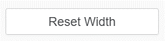
style: $WT.BUTTON -
labelText: The descriptive caption displayed in its center to indicator the purpose or the action to be executed. -
callbackThe action to be executed after pressing this button.
A button that provides the user a simple way to trigger an event. This includes things like searching for a query using a search engine, interacting with dialog boxes, or confirming an action.
Definition:
Sample Code:
Copy{
style: $WT.BUTTON,
labelText: "Reset Width",
callback: function () {
host.setProperty("boxWidthScale", 1);
}
}When this code is used, the controls looks like this:
-
-
In your JavaScript code, use "disabled" or "config" optional configuration values for properties to conditionally render controls
You can disable a control by specifying the value of “disabled” in its declaration. The value can be decided dynamically, for example, by another property’s value.
-
The following code shows how to disable a two-column control that contains two child controls by using a condition based on a property. With this condition, the whole row will be enabled only if the “Show Legend” check box is checked.
Copy{
style: $WT.EDITORGROUP,
items: [{
style: $WT.CHECKBOXANDLABEL,
propertyName: "showLegend",
labelText: "Show Legend"
}, {
style: $WT.TWOCOLUMN,
disabled: this.getHost().getProperty('showLegend') === "false",
items: [
{
style: $WT.LABEL,
width: "40%",
labelText: "Viz Name: "
}, {
style: $WT.TEXTBOX,
width: "60%",
propertyName: 'vizName'
}
]
}]
} -
You can also disable a control in pause mode. For example, since there is no data for the "colorby" attribute in pause mode, you can disable the "colorby" group control in pause mode. To do this:
- In your JavaScript code, add "mstrmojo.CustomVisUtility" in mstrmojo.requiresCls.
-
Use mstrmojo.CustomVisUtility.isInPauseMode() to determine whether the control is in pause mode.
-
Then, add the condition to disabled.
Copy{
style: $WT.COLORBYGROUP,
disabled: $CUSTOM_VIZ_UTIL.isInPauseMode()
}
You can download a simple JavaScript file that illustrates how to disable a control in pause mode.
-
For CharacterGroup, FillGroup and LineGroup, you can even disable any children within the control. You need to specify an extra “items” property, and list the child’s name and the condition that will disable it.
Copy{
style: $WT.CHARACTERGROUP,
propertyName: 'cg',
items: [{
childName: 'fontSize',
disabled: this.getHost().getProperty('fitToPage') === "true"
},{
childName: 'fontStyle',
disabled: true
}]
} -
You can also pass in the config that is used in setProperty(propertyName). Optional configuration for config includes:
- onPropertyChange: Function that returns relative properties that should be changed.
- suppressData: Flag that indicates whether or not to receive updated data from the back-end. If it is false, the loading dialog will show and partial updating will run after data is returned. If it is true, the process will be silenced and there will be no loading on the GUI. You may need to update your visualization by yourself.
- callback: Function that will be called after the value is saved and suppressData is set to true.
- requestDefinition: Flag that indicates whether to request definition in addition to data.
- clientUndoRedoCallback: Function that will be called after undo/redo. If this function is undefined, partial updating will run by default. Otherwise this function will run, and you may need to update your visualization by yourself.
By default, suppressData is set to “true” in the config for each control. The loading dialog will not show when a change is made. The visualization will render again after the value is saved unless a call back function is passed in.
Copy{
style: $WT.CHECKBOXANDLABEL,
propertyName: "showLegend",
labelText: "Show Legend",
config: {
suppressData: true,
onPropertyChange: function (propertyName, newValue) {
if (newValue === "false") {
return {
vizName: "No Legend"
};
}
return {};
},
callback: function () {
console.log("showLegend is changed.");
}
}
}In the code above, if the Show legend check box is unchecked, “No Legend” will be set to the vizName property simultaneously. The visualization will not re-render since a callback is given, but “showLegend is changed” will be displayed in the console.
-