MicroStrategy ONE
Customize the Login Screen UI Using Properties in Android
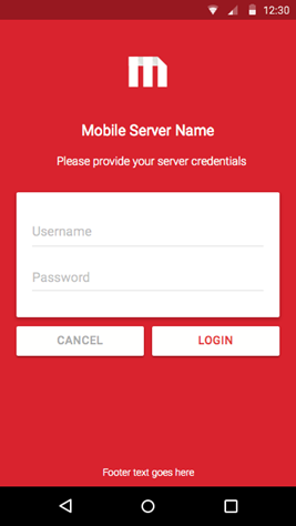
You can create a custom login screen without writing code, simply by using a properties file, called authentication_settings.json. For example, you could create a custom login screen for mobile server authentication on an Android phone, like the one shown below.
The MicroStrategy Mobile application reads this properties file to obtain the definition of the user interface to be used in the following authentication screens.
To customize one of these authentication screens, you first create the authentication_settings.json file, if it does not already exist, and save it under the /MicroStrategyMobile/app/src/main/res/raw folder. Then, you add the key:value pairs needed to achieve the customization you want. To customize keys with a string value, you can use a strings.xml file.
The properties you can customize on each authentication screen are described below:
You can customize the following properties on the mobile server login screen:
An illustration of the properties that can be customized on the mobile server login screen is shown below:

{
  "Server Authentication": {
    "Default": {
      "Title": {
        "Font": {
          "Name": "sans-serif",
          "ARGB": "0xA020F0"
        }
      },
      "icon image": "serverLoginIcon",
      "Background Color": {
        "ARGB": "0xFFA2CD5A"
      },
      "Header": {
        "Text": "this is the server default header",
        "Font": {
          "Name": "sans-serif-light",
          "ARGB": "0xFFFF00"
        }
      },
      "Login Button": {
        "Title": "SERVER_DEFAULT_LOGIN",
        "Font": {
          "Name": "casual",
          "ARGB": "0x9B9B9B"
        }
      },
      "Cancel Button": {
        "Title": "SERVER_DEFAULT_CANCEL",
        "Font": {
          "Name": "sans-serif-medium",
          "ARGB": "0xD9232E"
        }
      },
      "Footer": {
        "Text": "this is the server default footer",
        "Font": {
          "Name": "sans-serif-black",
          "Red": 255,
          "Green": 255,
          "Blue": 255,
          "Alpha": 255
        }
      }
    },
    "myDiv.myCompany.com": {
      "icon image": "serverLoginIcon",
      "Background Color": {
        "ARGB": "0xBFEFFF"
      },
      "Title": {
        "Font": {
          "Name": "sans-serif-black",
          "Red": 255,
          "Green": 0,
          "Blue": 0,
          "Alpha": 255
        }
      },
      "Header": {
        "Text": "SERVER_CUSTOM_HEADER",
        "Font": {
          "Name": "sans-serif-thin",
          "Red": 0,
          "Green": 255,
          "Blue": 0,
          "Alpha": 255
        }
      },
      "Login Button": {
        "Title": "SERVER_CUSTOM_LOGIN_BUTTON_TITLE",
        "Font": {
          "Name": "sans-serif",
          "Red": 0,
          "Green": 0,
          "Blue": 255,
          "Alpha": 255
        }
      },
      "Cancel Button": {
        "Title": "SERVER_CUSTOM_CANCEL_BUTTON_TITLE",
        "Font": {
          "Name": "sans-serif",
          "Red": 0,
          "Green": 0,
          "Blue": 255,
          "Alpha": 100
        }
      },
      "Footer": {
        "Text": "SERVER_CUSTOM_FOOTER",
        "Font": {
          "Name": "sans-serif-smallcaps",
          "Red": 0,
          "Green": 0,
          "Blue": 255,
          "Alpha": 255
        }
      }
    }
  }
}
A description of how to customize each key:value pair for mobile server authentication is provided below. If you want the customizations to apply to all mobile servers, add values under the "Default" key. If you want the customizations to apply to a specific mobile server, add values under the key with the mobile server name or IP address. For example, "mobileserver.com". You can add multiple mobile server keys, as needed.
-
Customize the value for the “Background Color” key, using either the hex color values
Copy"Background Color": {
"ARGB": "0xBFEFFF"
}or the RGB values
Copy"Background Color": {
"Red": 0,
"Green": 0,
"Blue": 255,
"Alpha": 255
} -
If the MicroStrategyMobile project is not open, open it in Android Studio, navigate to MicroStrategyMobile -> app -> src > main -> res and do the following:
Changing the Image
- Create the icon image and give it a meaningful name - for example, serverLoginIcon.png. Use Google's
recommendations for the size of the icon .
-
Copy the icon image to all the res -> drawable-* folders.
The names of files in the drawable-* folders must contain only lowercase a-z, 0-9, or _.
-
Set the value of the "icon image" key to the name of the icon image you just created. For example,
"icon image":"serverLoginIcon".
Changing the Image Size
By default, the icon image is 48dp x 48dp, but you may want to use an image with a different width and height for different sized screens/devices. To change the image size, you modify an XML file called dimens.xml, located in the following res -> values folder.
- values
- values-hdpi
- values-mdpi
- values-sw60dp
- values-sw600dp-xhdpi
- values-xhdpi
- values-xxhdpi
Each values-* folder has the icon image for a different screen resolutions. For example, if you are using a phone with very high image resolution, you would need to modify dimens.xml in values-xxhdpi.
-
Create an XML file called dimens.xml with the following content.
Copy<?xml version="1.0" encoding="utf-8"?>
<resources>
<dimen name="authentication_logo_width">48dp</dimen>
<dimen name="authentication_logo_height">48dp</dimen>
</resources> - Replace the values for authentication_logo_width and authentication_logo_height (48dp) with the width and height of your icon image for a specific device/screen size.
- Save dimens.xml in the appropriate folder under src -> main -> res.
- Repeat steps 1-3 for each device/screen size. For example, create separate dimens.xml files and save them under values-hdpi, values-mdpi, and so on.
- Create the icon image and give it a meaningful name - for example, serverLoginIcon.png. Use Google's
recommendations for the size of the icon .
- Title
-
Font Name: Set the value of the Font > Name key to a supported font. For example, the Roboto font is supported with different parameters, such as “sans-serif”, “sans-serif-light” etc.
-
Font Color: Customize the value for the Font > ARGB key in the same way you customize the Background Color key.
Copy"Title": {
"Font": {
"Name": "sans-serif",
"ARGB": "0xA020F0"
}
}
-
- Header
-
Text: Set the value of the Text key to the string displayed in the header position.
-
Font Name: Set the value of the Font > Name key to a supported font. For example, the Roboto font is supported with different parameters, such as “sans-serif”, “sans-serif-light” etc.
-
Font Color: Customize the value for the Font > ARGB key in the same way you customize the Background Color key.:
Copy"Header": {
"Text": "this is the server default header",
"Font": {
"Name": "sans-serif-light",
"ARGB": "0xFFFF00"
}
}
-
- Cancel Button
-
Text: Set the value of the Text key to the string displayed in the CANCEL button.
-
Font Name: Set the value of the Font > Name key to a supported font. For example, the Roboto font is supported with different parameters, such as “sans-serif”, “sans-serif-light” etc.
-
Font Color: Customize the value for the Font > ARGB key in the same way you customize the Background Color key.
Copy"Cancel Button": {
"Title": "SERVER_DEFAULT_CANCEL",
"Font": {
"Name": "sans-serif-medium",
"ARGB": "0xD9232E"
}
}
-
- Login Button
-
Text: Set the value of the Text key to the string displayed in the LOGIN button.
-
Font Name: Set the value of the Font > Name key to a supported font. For example, the Roboto font is supported with different parameters, such as “sans-serif”, “sans-serif-light” etc.
-
Font Color: Customize the value for the Font > ARGB key in the same way you customize the Background Color key.
Copy"Login Button": {
"Title": "SERVER_DEFAULT_LOGIN",
"Font": {
"Name": "casual",
"ARGB": "0x9B9B9B"
}
}
-
- Footer
Text: Set the value of the Text key to the string displayed in the footer position.
Font Name: Set the value of the Font > Name key to a supported font. For example, the Roboto font is supported with different parameters, such as “sans-serif”, “sans-serif-light” etc.
Font Color: Customize the value for the Font > Red/Green/Blue/Alpha keys in the same way you customize the Background Color key.
Copy"Footer": {
"Text": "this is the server default footer",
"Font": {
"Name": "sans-serif-black",
"Red": 255,
"Green": 255,
"Blue": 255,
"Alpha": 255
}
}
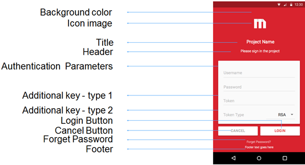
You can customize the following properties on the project login screen:
- Background Color
- Icon Image
- Title
- Header
- Authentication Parameters
- Additional Key - Type 1
- Additional Key - Type 2
- Login Button
- Cancel Button
- Forget Password
- Footer
An illustration of the properties that can be customized on the project login screen is shown below:
{
  "Project Authentication": {
    "Default": {
      "icon image":"projectLoginIcon",
      "Background Color":{
        "ARGB":"0x9A32CD"
      },
      "Title": {
        "Font": {
        "Name": "sans-serif-monospace",
          "ARGB":"0x98FB98"
        }
      },
      "Header": {
        "Text": "PROJECT_DEFAULT_HEADER",
        "Font": {
        "Name": "sans-serif-condensed",
          "ARGB":"0xFFFFFE"
        }
      },
      "Login Button": {
        "Title": "PROJECT_DEFAULT_LOGIN_BUTTON_TITLE",
        "Font": {
        "Name": "sans-serif-condensed",
          "ARGB":"0xD9232E"
        }
      },
      "Cancel Button": {
        "Title": "PROJECT_DEFAULT_CANCEL_BUTTON_TITLE",
        "Font": {
        "Name": "sans-serif-condensed-light",
          "ARGB":"0x9B9B9B"
        }
      },
      "Footer": {
        "Text": "PROJECT_DEFUALT_FOOTER",
        "Font": {
        "Name": "cursive",
          "Red": 255,
          "Green": 255,
          "Blue": 255,
          "Alpha": 255
        }
      },
      "Forget Password": {
        "Text": "FORGET_PASSWORD_TEXT_CUSTOM",
        "Font": {
        "Name": "monospace",
          "ARGB":"0xBBFFFFFF"
        }
      },
      "Authentication Parameters": [
        {
          "Key": "username",
          "Type": 0,
          "Configuration": {
            "Label":"PROJECT_DEFAULT_USERNAME",
            "Default Value":""
          }
        },
        {
          "Key": "password",
          "Type": 1,
          "Configuration": {
            "Label":"PROJECT_DEFAULT_PASSWORD",
            "Default Value":""
          }
        },
        {
          "Key": "token",
          "Type": 1,
          "Configuration": {
            "Label":"PROJECT_CUSTOM_TOKEN",
            "Default Value":""
          }
        },
        {
          "Key": "tokentype",
          "Type": 2,
          "Configuration": {
            "Label":"PROJECT_CUSTOM_TOKEN_TYPE",
            "Selections":[
              "PROJECT_CUSTOM_TOKEN_TYPE_SELECTION_0",
              "PROJECT_CUSTOM_TOKEN_TYPE_SELECTION_1",
              "PROJECT_CUSTOM_TOKEN_TYPE_SELECTION_2"
            ],
            "Default Selection":"0"
          }
        }
      ]
    },
    "MicroStrategy Tutorial": {
      "icon image":"projectLoginIcon",
      "Background Color":{
        "ARGB":"0x101E47"
      },
      "Title": {
        "Font": {
        "Name": "sans-serif",
          "ARGB":"0xFFFFFE"
        }
      },
      "Header": {
        "Text": "PROJECT_CUSTOM_HEADER",
        "Font": {
        "Name": "sans-serif-light",
          "ARGB":"0xFFFFFE"
        }
      },
      "Login Button": {
        "Title": "PROJECT_CUSTOM_LOGIN_BUTTON_TITLE",
        "Font": {
        "Name": "sans-serif-medium",
          "ARGB":"0x101E47"
        }
      },
      "Cancel Button": {
        "Title": "PROJECT_CUSTOM_CANCEL_BUTTON_TITLE",
        "Font": {
        "Name": "sans-serif-medium",
          "ARGB":"0x9B9B9B"
        }
      },
      "Forget Password": {
        "Text": "FORGET_PASSWORD_TEXT_CUSTOM",
        "Font": {
          "Name": "monospace",
          "ARGB":"0xBBFFFFFF"
        }
      },
      "Footer": {
        "Text": "",
        "Font": {
          "Name": "sans-serif-light",
          "Red": 255,
          "Green": 255,
          "Blue": 255,
          "Alpha": 255
        }
      },
      "Authentication Parameters": [
        {
          "Key": "username",
          "Type": 0,
          "Configuration": {
            "Label":"PROJECT_CUSTOM_USERNAME",
            "Default Value":""
          }
        },
        {
          "Key": "password",
          "Type": 1,
          "Configuration": {
            "Label":"PROJECT_CUSTOM_PASSWORD",
            "Default Value":""
          }
        },
        {
          "Key": "token",
          "Type": 1,
          "Configuration": {
            "Label":"PROJECT_CUSTOM_TOKEN",
            "Default Value":""
          }
        },
        {
          "Key": "tokentype",
          "Type": 2,
          "Configuration": {
            "Label":"PROJECT_CUSTOM_TOKEN_TYPE",
            "Selections":[
              "PROJECT_CUSTOM_TOKEN_TYPE_SELECTION_0",
              "PROJECT_CUSTOM_TOKEN_TYPE_SELECTION_1",
              "PROJECT_CUSTOM_TOKEN_TYPE_SELECTION_2"
            ],
            "Default Selection":"0"
          }
        }
      ]
    }
  }
}
A description of how to customize each key:value pair for project authentication is provided below. If you want the customizations to apply to all projects, add values under the "Default" key. If you want the customizations to apply to a specific project, add values under the key with the project name. For example, "MicroStrategy Tutorial". You can add multiple projects, as needed.
-
Customize the value for the “Background Color” key, using either the hex color values
Copy"Background Color": {
"ARGB": "0x9A32CD"
}or the RGB values
Copy"Background Color": {
"Red": 0,
"Green": 0,
"Blue": 255,
"Alpha": 255
}
-
Changing the Image
- Create the icon image and give it a meaningful name - for example, projectLoginIcon.png. Use Google's
recommendations for the size of the icon.
-
Copy the icon image to all the res->drawable-* folders.
The names of files in the drawable-* folders must contain only lowercase a-z, 0-9, or _.
-
Set the value of the "icon image" key to the name of the icon image you just created. For example,
"icon image":"projectLoginIcon"
Changing the Image Size
By default, the icon image is 48dp x 48dp, but you may want to use an image with a different width and height for different sized screens/devices. To change the image size, you modify an XML file called dimens.xml, located in the following res -> values-* folders.
- values
- values-hdpi
- values-mdpi
- values-sw60dp
- values-sw600dp-xhdpi
- values-xhdpi
- values-xxhdpi
Each values-* folder has the icon image for a different screen resolution. For example, if you are using a phone with very high image resolution, you would need to modify dimens.xml in values-xxhdpi.
-
Create an xml file called dimens.xml with the following content.
Copy<?xml version="1.0" encoding="utf-8"?>
<resources>
<dimen name="authentication_logo_width">48dp</dimen>
<dimen name="authentication_logo_height">48dp</dimen>
</resources> - Replace the values for authentication_logo_width and authentication_logo_height (48dp) with the width and height of your icon image for a specific device/screen size.
- Save dimens.xml in the appropriate values-* folder.
- Repeat steps 1-3 for each device/screen size. For example, create separate dimens.xml files and save them under values-hdpi, values-mdpi, values-xhdpi, and values-xxhdpi.
- Create the icon image and give it a meaningful name - for example, projectLoginIcon.png. Use Google's
recommendations for the size of the icon.
- Title
-
Font Name: Set the value of the Font > Name key to a supported font. For example, the Roboto font is supported with different parameters, such as “sans-serif”, “sans-serif-light” etc.
-
Font Color:Customize the value for the Font > ARGB key in the same way you customize the Background Color key.
Copy"Title": {
"Font": {
"Name": "sans-serif-monospace",
"ARGB": "0x98FB98"
}
}
-
- Header
-
Text: Set the value of the Text key to the string displayed in the header position.
-
Font Name: Set the value of the Font > Name key to a supported font. For example, the Roboto font is supported with different parameters, such as “sans-serif”, “sans-serif-light” etc.
-
Font Color: Customize the value for the Font > ARGB key in the same way you customize the Background Color key.
Copy"Header": {
"Text": "PROJECT_DEFAULT_HEADER",
"Font": {
"Name": "sans-serif-condensed",
"ARGB": "0xFFFFFE"
}
}
-
- Cancel Button
-
Text: Set the value of the Text key to the string displayed in the CANCEL button.
-
Font Name: Set the value of the Font > Name key to a supported font. For example, the Roboto font is supported with different parameters, such as “sans-serif”, “sans-serif-light” etc.
-
Font Color: Customize the value for the Font > ARGB key in the same way you customize the Background Color key.
Copy"Cancel Button": {
"Title": "PROJECT_DEFAULT_CANCEL_BUTTON_TITLE",
"Font": {
"Name": "sans-serif-condensed-light",
"ARGB": "0x9B9B9B"
}
}
-
- Login Button
-
Text: Set the value of the Text key to the string displayed in the LOGIN button.
-
Font Name: Set the value of the Font > Name key to a supported font. For example, the Roboto font is supported with different parameters, such as “sans-serif”, “sans-serif-light” etc.
-
Font Color: Customize the value for the Font > ARGB key in the same way you customize the Background Color key.
Copy"Login Button": {
"Title": "PROJECT_DEFAULT_LOGIN_BUTTON_TITLE",
"Font": {
"Name": "sans-serif-condensed",
"ARGB": "0xD9232E"
}
}
-
- Footer
Text: Set the value of the Text key to the string displayed in the footer position.
Font Name: Set the value of the Font > Name key to a supported font. For example, the Roboto font is supported with different parameters, such as “sans-serif”, “sans-serif-light” etc.
Font Color: Customize the value for the Font > Red/Green/Blue/Alpha keys in the same way you customize the Background Color key.
Copy"Footer": {
"Text": "PROJECT_DEFAULT_FOOTER",
"Font": {
"Name": "cursive",
"Red": 255,
"Green": 255,
"Blue": 255,
"Alpha": 255
}
}
- Forget Password
-
Text: Set the value of the Text key to the string displayed in the "Forgot password?" position, which can be linked to a website where the user can retrieve the password. This text link is only supported for the "Forget Password?" position. Other text on the Login screen cannot be defined as a link. Please note this customization does not include any “retrieve password” logic.
- The string for "Forget Password" is FORGET_PASSWORD_TEXT_CUSTOM in the json properties file.
- Create a values folder under res or use one you have already created.
-
Add a strings.xml file to the values folder. Add a FORGET_PASSWORD_TEXT_CUSTOM attribute to the strings.xml file and set its value to the string that represents the text that you want displayed. For example, the code below shows how to display "Forgot your password?".
Copy<?xml version="1.0" encoding="utf-8" standalone="no"?>
<resources>
<string name="FORGET_PASSWORD_TEXT_CUSTOM”><![CDATA[<a href="http://www.microstrategy.com">Forgot your password?</a>]]></string>
</resources> - Save strings.xml.
-
Font Name: Set the value of the Font > Name key to a supported font. For example, the Roboto font is supported with different parameters, such as “sans-serif”, “sans-serif-light” etc.
-
Font Color: Customize the value for the Font > Red/Green/Blue/Alpha keys in the same way you customize the Backround Color key.
Copy"Forget Password": {
"Text": "FORGET_PASSWORD_TEXT_CUSTOM",
"Font": {
"Name": "monospace",
"ARGB": "0xBBFFFFFF"
}
}
-
-
-
Key: Set the value to the name of a key that will be passed from client to server for project login. A standard login requires the “username” and “password” keys, but you can add additional keys that the mobile server can use for authentication - for example, “token”, “token type”, etc.
To add additional authentication keys, perform the following steps:.
-
Add the additional keys in the json file as shown in the sample code below.
Copy"Authentication Parameters": [
{
"Key": "username",
"Type": 0,
"Configuration": {
"Label": "PROJECT_DEFAULT_USERNAME",
"Default Value": ""
}
},
{
"Key": "password",
"Type": 1,
"Configuration": {
"Label": "PROJECT_DEFAULT_PASSWORD",
"Default Value": ""
}
},
{
"Key": "token",
"Type": 1,
"Configuration": {
"Label":"PROJECT_CUSTOM_TOKEN",
"Default Value": ""
}
},
{
"Key": "tokentype",
"Type": 2,
"Configuration": {
"Label": "PROJECT_CUSTOM_TOKE_TYPEN",
"Selections": [
"PROJECT_CUSTOM_TOKEN_TYPE_SELECTION_0",
"PROJECT_CUSTOM_TOKEN_TYPE_SELECTION_1",
"PROJECT_CUSTOM_TOKEN_TYPE_SELECTION_2"
]
}
}
] - Customize the login task in mobile server to use the additional keys for authentication. For detailed steps, please refer to Customizing Authentication on the Mobile Server.
-
-
Type: Set the type of input. There are three types in total.
- 0 represents a normal text field input
- 1 represents an encrypted text field input
- 2 represents a drop-down selector with different selections
-
Label: Set the value to the string that will be displayed in the login dialog in the corresponding position.
-
Default Value: Set the default value for the corresponding key.
-
Selections: Set the selection list for a key of Type 2, which is a drop-down list.
-
Default Selection: Set the default selection for a key of Type 2.
-
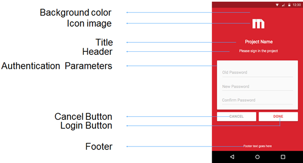
You can customize the following properties on the project login screen:
- Background color
- Icon Image
- Title
- Header
- Authentication Parameters
- Login button
- Cancel Button
- Footer
An illustration of the properties that can be customized is shown below:
{
  "Change Password": {
    "Default": {
      "icon image": "changePasswordIcon",
      "Background Color":{
        "ARGB": "0xD9232E"
      },
      "Title": {
        "Font": {
          "Name": "sans-serif",
          "ARGB": "0xFFFFFE"
        }
      },
      "Header": {
        "Text": "CHANGE_PASSWORD_HEADER",
        "Font": {
          "Name": "sans-serif-light",
          "ARGB": "0xFFFFFE"
        }
      },
      "Login Button": {
        "Title": "CHANGE_PASSWORD_LOGIN_BUTTON_TITLE",
        "Font": {
          "Name": "sans-serif-medium",
          "ARGB": "0xD9232E"
        }
      },
      "Cancel Button": {
        "Title": "CHANGE_PASSWORD_CANCEL_BUTTON_TITLE",
        "Font": {
          "Name": "sans-serif-medium",
          "ARGB": "0x9B9B9B"
        }
      },
      "Footer": {
        "Text": "",
        "Font": {
          "Name": "sans-serif",
          "Red": 255,
          "Green": 255,
          "Blue": 255,
          "Alpha": 255
        }
      },
      "Authentication Parameters": [
        {
          "Key": "oldPassword",
          "Type": 1,
          "Configuration": {
            "Label": "CHANGE_PASSWORD_OLD_PASSWORD",
            "Default Value": ""
          }
        },
        {
          "Key": "newPassword",
          "Type": 1,
          "Configuration": {
            "Label": "CHANGE_PASSWORD_NEW_PASSWORD",
            "Default Value": ""
          }
        },
        {
          "Key": "confirmNewPassword",
          "Type": 1,
          "Configuration": {
            "Label": "CHANGE_PASSWORD_CONFIRM_PASSWORD",
            "Default Value": ""
          }
        }
      ]
    }
  }
}
A description of how to customize each key:value pair for the change password dialog is provided below. You add values under the "Default" key, and your customizations are applied to all projects and mobile servers.
-
Customize the value for the “Background Color” key, using either the hex color values
Copy"Background Color":{
"ARGB": "0xD9232E"
}or the RGB values
Copy"Background Color":{
"Red": 0,
"Green": 0,
"Blue": 255,
"Alpha": 255
} -
Changing the Image
- Create the icon image and give it a meaningful name - for example, changePasswordIcon.png. Use Google's recommendations for the size of the icon.
-
Copy the icon image to all the res->drawable-* folders.
The names of files in the drawable-* folders must contain only lowercase a-z, 0-9, or _.
-
Set the value of the "icon image" key to the name of the icon image you just created. For example,
"icon image":"changePasswordIcon"
Changing the image size
By default, the icon image is 48dp x 48dp, but you may want to use an image with a different width and height for different sized screens/devices. To change the image size, you modify an XML file called dimens.xml, located in the following res -> values-* folders.
- values
- values-hdpi
- values-mdpi
- values-sw60dp
- values-sw600dp-xhdpi
- values-xhdpi
- values-xxhdpi
Each values-* folder has the icon image for a different screen resolutions. For example, if you are using a phone with very high image resolution, you would need to modify dimens.xml in values-xxhdpi.
-
Create an xml file called dimens.xml with the following content.
Copy<?xml version="1.0" encoding="utf-8"?>
<resources>
<dimen name="authentication_logo_width">48dp</dimen>
<dimen name="authentication_logo_height">48dp</dimen>
</resources> - Replace the values for authentication_logo_width and authentication_logo_height (48dp) with the width and height of your icon image for a specific device/screen size.
- Save dimens.xml in the appropriate src/main/res/values* folder.
- Repeat steps 1-3 for each device/screen size. For example, create separate dimens.xml files and save them under values-hdpi, values-mdpi, and so on.
- Title
-
Font Name: Set the value of the Font > Name key to a supported font. For example, the Roboto font is supported with different parameters, such as “sans-serif”, “sans-serif-light” etc.
-
Font Color:Customize the value for the Font > ARGB key in the same way you customize the Background Color key.
Copy"Title": {
"Font": {
"Name": "sans-serif",
"ARGB": "0xFFFFFE"
}
}
-
- Header
-
Text: Set the value of the Text key to the string displayed in the header position.
-
Font Name: Set the value of the Font > Name key to a supported font. For example, the Roboto font is supported with different parameters, such as “sans-serif”, “sans-serif-light” etc.
-
Font Color: Customize the value for the Font > ARGB key in the same way you customize the Background Colo key.
Copy"Header": {
"Text": "CHANGE_PASSWORD_HEADER",
"Font": {
"Name": "sans-serif-light",
"ARGB": "0xFFFFFE"
}
}
-
- Cancel Button
-
Text: Set the value of the Text key to the string displayed in the CANCEL button.
-
Font Name: Set the value of the Font > Name key to a supported font. For example, the Roboto font is supported with different parameters, such as “sans-serif”, “sans-serif-light” etc.
-
Font Color: Customize the value for the Font > ARGB key in the same way you customize the Background Color key.
Copy"Cancel Button": {
"Title": "CHANGE_PASSWORD_CANCEL_BUTTON_TITLE",
"Font": {
"Name": "sans-serif-medium",
"ARGB": "0x9B9B9B"
}
}
-
- Login Button
-
Text: Set the value of the Text key to the string displayed in the LOGIN button.
-
Font Name: Set the value of the Font > Name key to a supported font. For example, the Roboto font is supported with different parameters, such as “sans-serif”, “sans-serif-light” etc.
-
Font Color: Customize the value for the Font > ARGB key in the same way you customize the Background Color key.
Copy"Login Button": {
"Title": "CHANGE_PASSWORD_LOGIN_BUTTON_TITLE",
"Font": {
"Name": "sans-serif-medium",
"ARGB": "0xD9232E"
}
}
-
- Footer
Text: Set the value of the Text key to the string displayed in the footer position.
Font Name: Set the value of the Font > Name key to a supported font. For example, the Roboto font is supported with different parameters, such as “sans-serif”, “sans-serif-light” etc.
Font Color: Customize the value for the Font > Red/Green/Blue/Alpha keys in the same way you customize the Background Color key.
Copy"Footer": {
"Text": "PROJECT_DEFAULT_FOOTER",
"Font": {
"Name": "cursive",
"Red": 255,
"Green": 255,
"Blue": 255,
"Alpha": 255
}
}
-
-
Key: This is the name of the key that will be passed from client to server for project login. Only the values for Label and Default Value can be customized for each key.
Copy"Authentication Parameters": [
{
"Key": "oldPassword",
"Type": 1,
"Configuration": {
"Label":"CHANGE_PASSWORD_OLD_PASSWORD",
"Default Value": ""
}
},
{
"Key": "newPassword",
"Type": 1,
"Configuration": {
"Label":"CHANGE_PASSWORD_NEW_PASSWORD",
"Default Value": ""
}
},
{
"Key": "confirmNewPassword",
"Type": 1,
"Configuration": {
"Label":"CHANGE_PASSWORD_CONFIRM_PASSWORD",
"Default Value": ""
}
}
]
-
Label: Customize the value of the string that will be displayed for the corresponding key in the change password dialog.
-
Default Value: Customize the default value for the corresponding key in the change password dialog.
-
Customize Strings Using a strings.xml File
A typical way to customize string values is to use a strings.xml file. For example, steps to customize the string SERVER_CUSTOM_HEADER in the json are described below.
- Create a values folder under res.
- Create a string.xml file in the values folder and add the customized string to this file. If you need to customize the string for different locales, use the procedures in steps 3 and 4.
- Create a locale-specific values-* folder under res or use the one that you have already created. For example, for US English, create or use a folder called values-en-rUS. This folder is a sibling of the values folder inside res. If the MicroStrategyMobile project is not open, open it in Android Studio and navigate to MicroStrategyMobile -> app -> src > main -> res. A list of all locale-specific folders you can create or use are shown below:
values-da-rDK
values-de
values-en
values-en-rGB
values-en-rUS
values-es
values-fr
values-it
values-ja
values-ko
values-nl
values-pl
values-pt
values-ru
values-sv
values-zh-rCN
values-zh-rTW
- Add a strings.xml file to the values-en-rUS folder or use the one that you have already created.
-
Add a SERVER_CUSTOM_HEADER attribute to the strings.xml file and set its value to the string that represents the info that you want displayed.
Copy<?xml version="1.0" encoding="utf-8" standalone="no"?>
<resources>
<string name="SERVER_CUSTOM_HEADER”>”This is server header”</string>
<string name="SERVER_CUSTOM_HEADER”>”This is server header”</string>
...
</resources> - Save strings.xml.