MicroStrategy ONE
Custom Context Menu Items
Custom context menu items can be configured to allow for changes to properties specific to your visualization. For example, whether to show the Date Labels on your visualization, or open the pop-up format editor to perform shape formatting on a certain shape. Custom context menu items are configured by setting the customConfig variable when using the getContextMenuConfig API.
The customConfig variable should be an array, should be an object array and each object has a type property and properties specific to the kind of menu item being configured. All the supported types can be found in Enumeration mstrmojo.CUSTOM_CONTEXT_MENU.
Most menu items can bind with custom properties. For more information on custom properties, see Create and Use Custom Properties.
Configuring the Context Menu Items
This section describes the properties that can be configured for each type:
NORMAL
Add a menu item and onClick callback will be called when clicked
Properties
name: (required) The text label shown on menu item
onClick: (required and should be function) Tthe callback function which will be called when menu item clicked.
isDisabled: (optional) Whether the menu item is disabled. When disabled, it will show disabled style and do nothing when clicked. Default value is false.
isShown: (optional) Show condition for this menu item. Default value is true.
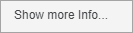
Sample UI
Default:
With isDisabled set to true:
Example
{
    type: mstrmojo.CUSTOM_CONTEXT_MENU.NORMAL,
    name: "Show more Info...",
    onClick: function () {
         // do something when clicked
    }
}
TOGGLE
Add a menu item which switch between on and off status when clicked. It will show a check marker in front for on status.
Properties
name: (required) The text label shown on menu item.
currentValue: (required) True for on status, and false for off status.
onClick: (required) The callback function which will be called when menu item clicked.
The onClick function has one param which is boolean, indicate the new value for the status after menu is clicked.
isShown: (optional) Show condition for this menu item. Default value is true.
Sample UI
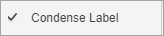
Example
{
    type: mstrmojo.CUSTOM_CONTEXT_MENU.TOGGLE,
    name: "Condense Label",
    currentValue: true,
    onClick: function (newValue) {
        //newValue: true/false refer to on/off status
    }
}
Binding with Custom Properties
name: (required) The text label shown on menu item
propertyName: (required) The name of the custom property binding with this context menu.
showFormatPanel: (optional) If true, when clicking this context menu, the format panel which contains the controls bound to the same property is shown. Default value is true
config: (optional) Config for setProperty. (For details, click here)
isShown: (optional) Show condition for this menu item. Default value is true.
Example
{
    type: mstrmojo.CUSTOM_CONTEXT_MENU.TOGGLE,
    name: "Condense Label",
    propertyName: "condenseLabel",
    showFormatPanel: true
}
SEPARATOR
A menu separator which used to divide different group of context menu.
Sample UI
Example
{
    type: mstrmojo.CUSTOM_CONTEXT_MENU.SEPARATOR
}
SUBMENU
A menu item which will launch sub menu when hovered. Submenu is defined by subMenuConfig.
Properties
name: (required) The text label shown on menu item.
subMenuConfig (required) An array describing the menu configuration for the submenu which has the same format as the customConfig.
isShown: (optional) Show condition for this menu item. Default value is true.
Sample UI
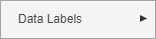
Example
{
    type: mstrmojo.CUSTOM_CONTEXT_MENU.SUBMENU,
    name: "Data Label",
    subMenuConfig: []
}
SINGLE_SELECT_LIST
A menu group whose items are mutually exclusive. If one is selected, the others will be unselected.
Properties
currentValue: (required)value decide which item in list is selected
onClick: (required)the callback function which will be called when one menu item clicked. The onClick function has one param which is the new value after menu is clicked
items: (required)array of object which has name and value, name is text label show for each menu item, value is value for each menu item
isShown: (optional)show condition for this menu item. Default value is true.
Sample UI

Example
Binding with Custom Properties
name: (required) The text label shown on menu item
propertyName: (required) The name of the custom property binding with this context menu.
showFormatPanel: (optional) If true, when clicking this context menu, the format panel which contains the controls bound to the same property is shown. Default value is true
config: (optional) Config for setProperty. (For details, click here)
isShown: (optional) Show condition for this menu item. Default value is true.
Example
{
    type: mstrmojo.CUSTOM_CONTEXT_MENU.SINGLE_SELECT_LIST,
    propertyName: "chartType",
    showFormatPanel: true,
    items: [
        {
            name: "Bar",
            value: "0"
        },
        {
            name: "Line",
            value: "1"
        },
        {
            name: "Circle",
            value: "2"
        }
    ]
}
MULTI_SELECT_LIST
A menu group which each item could be selected or deselected. Must bind with a two-level property. Each item has its own property.
Properties
This must bind with a custom property. Use multiple TOGGLE menus if you don't need binding with a custom property.
name: (required) The text label shown on menu item
propertyName: (required) The name of the custom property binding with this context menu.
showFormatPanel: (optional) If true, when clicking this context menu, the format panel which contains the controls bound to the same property is shown. Default value is true
config: (optional) Config for setProperty. (For details, click here)
isShown: (optional) Show condition for this menu item. Default value is true.
Sample UI
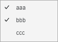
Example
{
    propertyName: "ppp",
    showFormatPanel: true,
    type: mstrmojo.CUSTOM_CONTEXT_MENU.MULTI_SELECT_LIST,
    items: [
        {
            labelText: "aaa",
            propertyName: "a"
        },
        {
            labelText: "bbb",
            propertyName: "b"
        },
        {
            labelText: "ccc",
            propertyName: "c"
        }
    ]
}
FORMAT
A menu item that opens a pop-up format editor when clicked.
Other Properties
name: (required) The text label shown on menu item. Default is 'Format'
isShown: (optional) Show condition for this menu item. Default is not shown on library and VI presentation mode.
formatConfig: (required) Defines the content for the format pop-up editor opened, see Configure the Pop-Up Format Editor for details.
showFormatPanelName: (optional) The name for which format panel will shown when this menu item clicked.
Sample UI
Menu Item:

Pop-Up Format Editor:
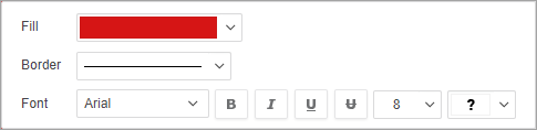
Example
{
    type: mstrmojo.CUSTOM_CONTEXT_MENU.FORMAT,
    formatConfig: [{
        type: $FORMAT_CONTROL_TYPE.COLORBYGROUP,
        isShown: isColorbyAttribute,
        colorInfo: data.colorInfo,
        width: "150px",
        label: {
            text: "Fill",
            width: "50px"
        }
    }, {
        type: $FORMAT_CONTROL_TYPE.LINEGROUP,
        propertyName: "lg",
        hideColorControl: true,
        label: {
            text: "Border",
            width: "50px"
        }
    }, {
        type: $FORMAT_CONTROL_TYPE.CHARACTERGROUP,
        propertyName: "cg",
        label: {
            text' "Fot",
            width: "50px"
        }
    }],
    showFormatPanelName: "Shape Formatting"
}
Configure the Pop-Up Format Editor
The following section shows how to configure the pop-up format editor.
FILLGROUP
Combination of controls that help set fill color and transparency. The property names of the child controls have been preset: fillColor and fillAlpha, the same as FILLGROUP on the Properties panel.
Common Properties
label: Configures the label before the control, it could has properties:
- text: (required) Text for the label.
- width: (optional) The width of the label the actual width of the label is used.
isShown: Show condition for this menu item.
Other Properties
propertyName: (required) Property name bound with this control.
config: (optional) Configuration for setProperty, for details click here
showFillColor: (optional) Show or hide the color control, default value is true
showFillAlpha: (optional) Show or hide the transparency control, default value is true
showFormatPanel: (optional) If true, when clicking this context menu, the format panel which contains the controls bound to the same property is shown. Default value is true.
Sample UI

Example
{
    type: $FORMAT_CONTROL_TYPE.FILLGROUP,
    propertyName: "fill",
}
LINEGROUP
Combination of controls that help set line style and color. The property name of the child controls have been preset: lineColor and lineStyle, , the same as LINEGROUP on the Properties panel.
Common Properties
label: Configures the label before the control, it could has properties:
- text: (required) Text for the label.
- width: (optional) The width of the label the actual width of the label is used.
isShown: Show condition for this menu item.
Other Properties
propertyName: (required) Property name bound with this control.
config: (optional) Configuration for setProperty, for details click here
hideColorControl:(optional)hide the color control or not, default value is false.
showFormatPanel: (optional) If true, when clicking this context menu, the format panel which contains the controls bound to the same property is shown. Default value is true.
Sample UI
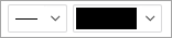
Example
{
type: $FORMAT_CONTROL_TYPE.LINEGROUP,
propertyName: "border"
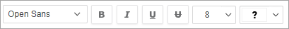
}CHARACTERGROUP
Combination of controls that help set font family, style, size and color. The property names of the child controls have been preset: fontFamily, fontStyle, fontSize, and fontColor, the same as CHARACTERGROUP on the Properties panel.
Common Properties
label: Configures the label before the control, it could has properties:
- text: (required) Text for the label.
- width: (optional) The width of the label the actual width of the label is used.
isShown: Show condition for this menu item.
Other Properties
propertyName: (required) Property name bound with this control.
config: (optional) Configuration for setProperty, for details click here
showFormatPanel: (optional) If true, when clicking this context menu, the format panel which contains the controls bound to the same property is shown. Default value is true.
Sample UI
Example
{
    type: $FORMAT_CONTROL_TYPE.CHARACTERGROUP,
    propertyName: "font"
}
COLORBYGROUP
Controls to change color in color palette for given colorInfo. This control only changes the color palette for certain attribute combinations defined by colorInfo. (The COLORBYGROUP on Properties changes the color palette for all attribute combinations.)
Common Properties
label: Configures the label before the control, it could has properties:
- text: (required) Text for the label.
- width: (optional) The width of the label the actual width of the label is used.
isShown: Show condition for this menu item.
Other Properties
colorInfo: (required) An array of attribute element IDs which will be foramatted.
The values for colorInfo could be retrieved from DataInterface.getDawData by adding
{colorByInfo: this.zonesModel && this.zonesModel.getColorByAttributes()} to the parameters.
showFormatPanel: (optional) If true, when clicking this context menu, the format panel which contains the controls bound to the same property is shown. Default value is true.
Sample UI

Example
{
    type: $FORMAT_CONTROL_TYPE.COLORBYGROUP,
    colorInfo:[
        "h2007;8D679D5111D3E4981000E787EC6DE8A4",
        "h2;8D679D3711D3E4981000E787EC6DE8A4"
    ]
}
Show or Hide On Different Conditions
Each menu item has a property called isShown which should be a boolean to decide whether this menu item will show or hide.
For example, the mstrmojo.CUSTOM_CONTEXT_MENU.FORMAT type is hidden for both Library and Web Presentation Mode by default.
To change the behavior to only hide on Web Presentation Mode, add the utility as the isShown property value:
{
    type: mstrmojo.CUSTOM_CONTEXT_MENU.FORMAT,
    isShown: !mstrmojo.CustomVisUtility.isVIPresentationMode(),
    formatConfig: [{
        type: $FORMAT_CONTROL_TYPE.FILLGROUP,
        propertyName: "fg",
        label: {
            text: "Fill",
            width: "50px"
        }
    }, {
        type: $FORMAT_CONTROL_TYPE.LINEGROUP,
        propertyName: "lg",
        hideColorControl: true,
        label: {
            text: "Border",
            width: "50px"
        }
    }, {
        type: $FORMAT_CONTROL_TYPE.CHARACTERGROUP,
        propertyName: "cg",
        label: {
            text: "Font",
            width: "50px"
        }
    }],
    showFormatPanelName: "Shape Formatting"
}
More utility functions can be found in CustomVisUtiltilty.js.